About
I've been in leadership since I joined the Navy in 1980. After the Navy, I was hired by a growing manufacturing company in Boulder, Colorado. I worked there for 16 years, starting as Lead Mechanic/Shop Electrician and finishing my tenure in the manufacturing industry as a Vice President of Operations at a sister division. Along the way, I got my Bachelor's Degree in Computer Information Systems from Regis University, minoring in Business Management.
WELCOME...
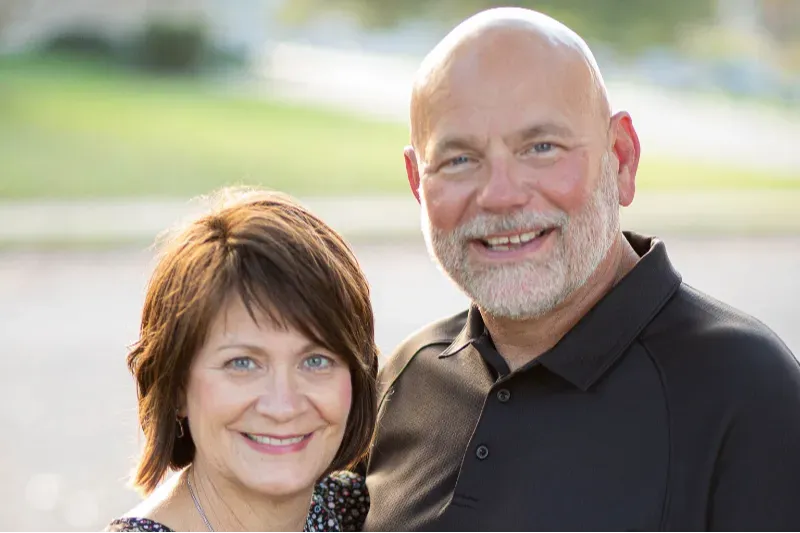
I'm Kevin Stone
I've been married to Terri for 40 years; for 21 of those, we served together in ministry. We have three grown children and 11 grandkids, eight boys and three girls! I enjoy working on my house, golf, hanging on my bass boat, and occasionally playing Texas Hold 'em poker with good friends.
I founded Executive Pastor Online because I'm passionate about the local church and what Jesus calls us to do through it.

Leader
Over 35 years of executive leadership applied to the church.

Administrator
Coaching church leaders through planning and execution in all operational areas of the church.

Systems Thinker
Improving performance through systems,
processes, and methods in all areas of ministry.

Sharing What I Know
Also on this site is my blog. I regularly write about church leadership and infrastructure development, including specifics on leadership techniques and the details of implementing systems, processes, and methods that enable the church to succeed. I occasionally share my thoughts on various other related topics, sharing some of my passion for reaching the lost and helping people learn about and experience the love of Christ.
I aim to create insightful, relevant content that you can put to work in your ministry. This site is for you if you are in a leadership position in the church. I typically post four to five times a week.

"As I reflect on this year I'm blown away by how much you've helped me
accomplish! You've helped me build a
foundation in my church that's anchored in strategic planning, beginning with consistent data collection and analysis."
- Jeremy Miller
"The help you have provided has been a much-needed 'force multiplier.' Your coaching of my work added up to a sum much greater than two guys talking over a video conference call!"
- Tom Clegg
"Kevin assisted me in the identification of key infrastructure priorities and helped me navigate through the challenges of establishing processes where there were none."
- Mark Debreceni
Why I Do What I Do
Years ago, as the Executive Pastor of my church, I began thinking about how I could serve small and midsized churches that couldn't hire ministers to manage their operations and administration. In 2006, I founded the first iteration of the site you see today! The idea was to provide the skill set and fundamental concepts to smaller churches that needed an executive pastor but didn't have the budget for the position.
So, after 18 years serving as Executive Pastor of a growing Independent Christian Church in the suburbs of Philadelphia, I'm now a full-time Executive Coach, sharing what I've learned with church administrators and other senior leaders around the country.